


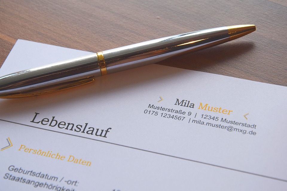
A personal Letterhead
You are a brand. You are a product. You will market yourself as such. You have a set of qualities and skills, technical and personal, that will meet an employer's needs. You will provide utility to someone else, just as a product provides utility to you. You will be competing with other job seekers; the same way products compete on the supermarket shelf. So, you need branding.
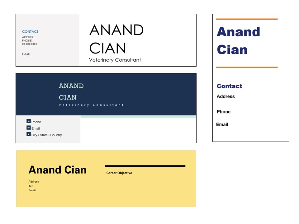
A personalized letterhead is one of the ways to showcase your brand. You will use this letterhead on all the documents you provide in an application for a job, or even applications to graduate school.
There are several templates available online or embedded within word processing software. Some of the key aspects you should consider include:
Color
You may not have much room to play around with colors within the resume/CV or cover letter, but you can play around with colors on the letter head, in a way that will change the appearance of the whole document. The color you choose should not compromise the readability of the letterhead, so a good contrast is necessary. Note too that the color you choose will depend on the profession you are applying into. Black and white might work well for professions that do not put much priority on appearances, such as professors, bankers. On the other hand, if you are applying for job in beauty, modeling, web development, photography, or the creative industry in general, then great colors will be beneficial.
Color draws the eyes and can be used to attract the employer to specific parts of your letterhead (or resume/CV/cover letter in general). Color creates bias on the letterhead, it expresses that some words are more important than others, which is usually the case, but should be handled carefully knowing that words that do not have the same color advantage may not be given the same importance by the employer.
The colors you choose must communicate the traits you wish to express to the employer, such as confidence and responsibility (Blue), trust, happiness, calmness (Yellow), creativity (Orange or purple), health and nutrition (Orange or green). We discourage the use of green, except in very limited situations, such as careers related to the environment and sustainability, a softer green may be recommended. In most other circumstances, green represents naivety and a lack or experience. We also discourage the use of black backgrounds, black expresses power, but is also too aggressive. Red may be used in very specific circumstances where extraordinary levels of bold beauty, passion and importance are necessary. In most other circumstances, red expresses instability, volatility, and danger.
Font
Your name should be on a larger font than the text that follows. The font should be spaced out in a way that makes it very easy to read. Serif fonts are traditional while sans serif creates a more modern look and easier to read when printed small.
Layout
You are free to stretch the limits on the layout of your letterhead. For example, your letter head could be laid out as a column on the left side of the resume (or CV or cover letter), or it could be at the top as a header. Ensure that the letterhead is not too dominating on the document, remember the content of the document is still the more important aspect, the letter head plays the curb appeal role more.
Careful Career Decisions
Easy Careers. All rights reserved.